
RENARTS
We led a complete rebrand for Renarts, creating a flexible visual identity inspired by the brand's heritage in streetwear, sports culture, and premium sneakers. From a responsive logo system and custom lettering to an original mascot, brand guidelines, and apparel graphics, every element was designed to build a cohesive and recognizable brand experience across every touchpoint.
Client
Renarts
Services
Brand Identity · Lettering · Illustration · Apparel Graphics

MOODBOARD
The first RENARTS been Founded in 1981, so the goal was to keep the sport legacy of the brand and adding a modern twist to it. We found inspiration in the the retro college sport Graphics, and decided to have a Letterform icon/mark, a sporty/modern but timeless script and a Fox mascot as the main elements of the branding.

WORDMARK & MARK

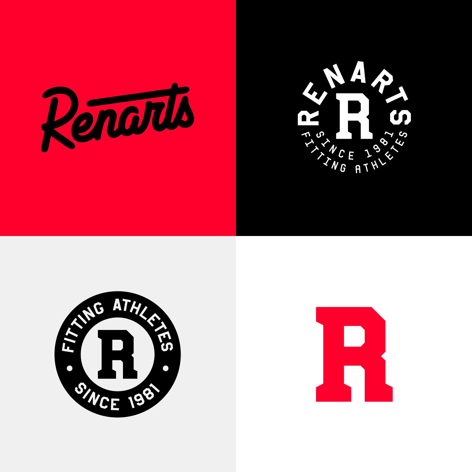
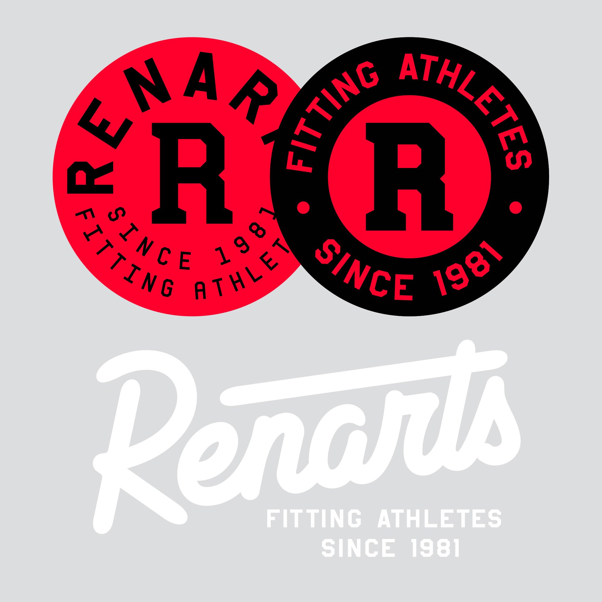
The full responsive branding including the 4 elements, Wordmark, Mark and 2 badges.
COLOR & TYPE

MASCOT
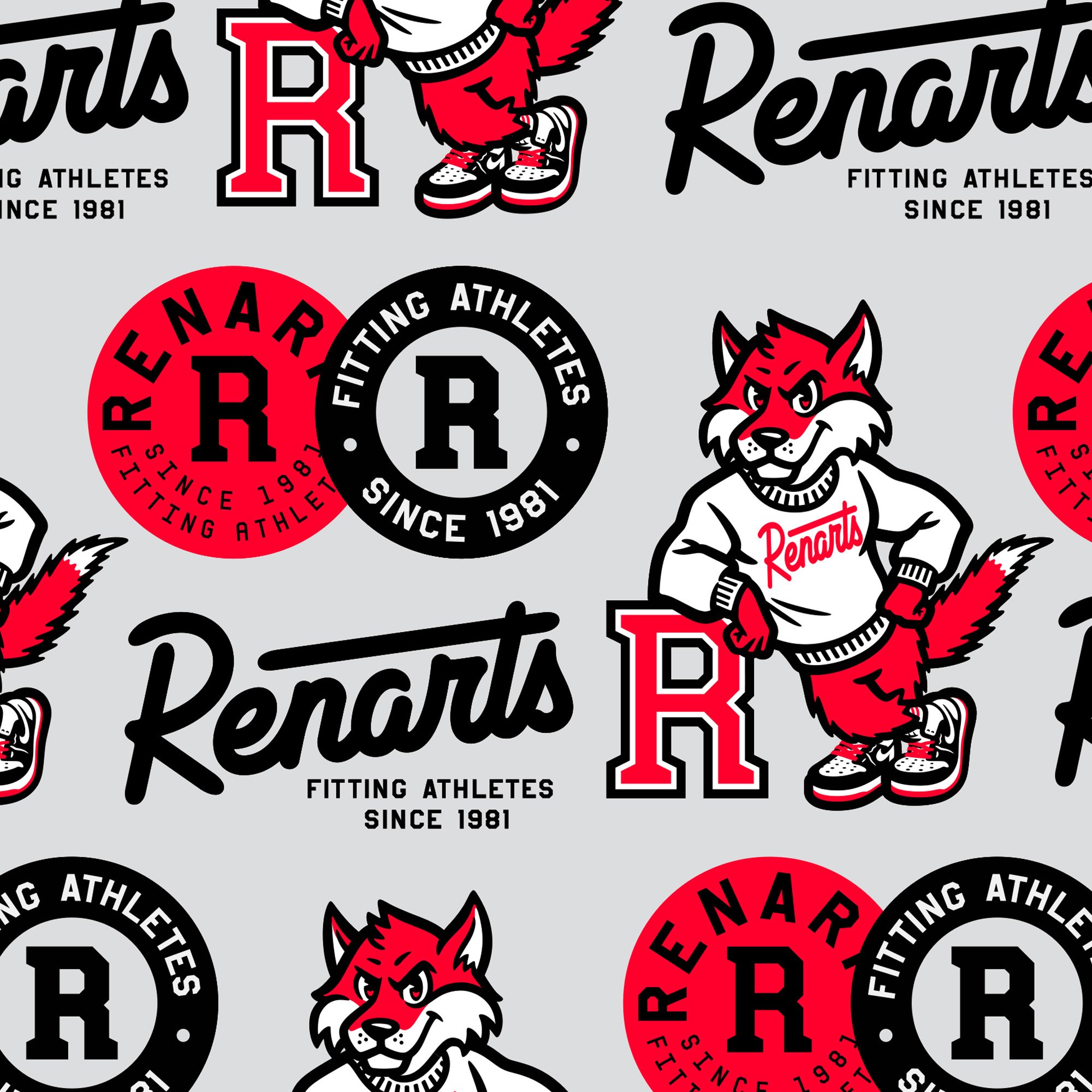
With RENARTS been located in New York, the choice of a red fox come naturally to embody the brand. The infrared color, a well known color in the sneakers culture, gives him a modern note. Inspired by the vintage sport aesthetic we created a friendly and proud Fox. We decided to have him wear a pair of some famous sneakers: the Air Jordan ones.


BRAND GUIDELINES

BRANDING IN USE
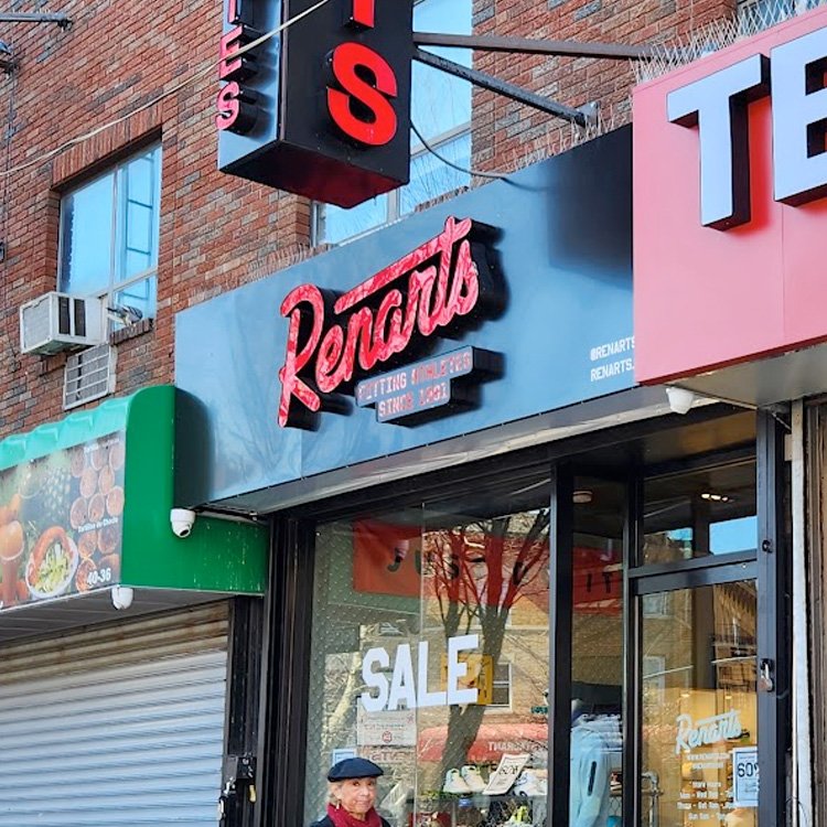
The branding is versatile and can be use on a lot of different mediums: Merch, Environmental Design, Social media and many more…